Relearning CSS: Part Three
In this post I deleve into styling images, z-index + positioning, and when to use !important.
If you want to go back and read part two, which covers sizing units, the box model and links, click here.
Images
Changing the height and width of an image is straightforward.
<img src="image-link"/>img {
width: 50px;
height: 100px;
}Usually image resizing will use pixels however it’s also possible to see things such as percentages used in stylesheets.
What if you wanted change an image into a circle image for a profile page?
Ideally, the image must be square. And then you need to add a width and height.
See the Pen Part Three of Relearning CSS by ummadev (@ummadev) on CodePen.
Z-Index and Positioning
Whilst margin will change where the element sits on the page, there are various different positions such as relative, fixed and static, which help with HOW the element is positioned on the page.
Let’s Cover Position First
Relative
This is the element’s original position in the flow of the document. Unlike static you can using values such as left, right, top, bottom and z-index.
position: relative;
Static
All elements by default are static. Elements with a static position are not effect by top, bottom, left or right properties.
position: static;
Fixed
Fixed can help with position elements relative to the document but with this position means it isn’t effected by scrolling.
Once it has been positioned on the page, it will not move when you go up and down a page.
<div class="parent">
  <p>placeholder text</p>
  <div class="child">
    <p>I am fixed!</p>
  </div>
</div>
.parent {
position relative;
}
.child {
background: red;
bottom: 0;
left: 0;
right: 0;
position: fixed;
}Absolute
If the child element has position: absolute; appended to it, the parent will behave like the child isn’t there.
When you try to set other values, such as left, right or bottom, the child element responds not to the parent but the dimensions of the document.
To make the child element positioned absolutely from its parent element you need position:relative appended to it.
<div class="parent">
  <div class="child"> Child element </div>
</div>
.parent {
background: red;
height: 100px;
width: 100px;
position: relative
}
.child {
background: green;
positoin: absolute;
bottom: 0;
left: 0;
right: 0;
}Sticky
This position is almost a go-between relative and fixed. It is not as popular as the other positions but it enables you to position elements relative to anything on the page and once the user has scrolled past a certain point, the position of the element will remain in a specific position and fix it there.
An example of this is a sticky nav. Initially the position is at the top, as you start to scroll, the position of the nav is positioned at the top.
Inherit
If the position value doesn’t cascade, this can force it to, by inheriting the position value from its parent.
Going Back to z-index
Okay but what is z-index and what does positioning have to do with all of this?
z-index enables you to layer elements on a page. Let’s say you have a header and on top of that element you want a navigation. Usually if you want the navigation to be inside the header, you wouldn’t use a z-index. However, if you want the navigation to let’s say overlap at bottom of the header, you might use a z-index.
Here is a small code example:
<div class="one">My first div</div>
<div class="two">My second div</div>
.one {
width: 100px;
height: 25px;
background: purple;
}
.two {
width: 50px;
height: 50px;
background: red;
z-index: 99;
position: relative;
}In the example above, the z-index is set to a high number to ensure nothing else overlaps it. You can have a z-index which includes 1, 2, 3 etc. depending on the number of elements you want to overlap. The position is set to relative to enable z-index to work as it should.
The codepen below shows an examples of z-index.
See the Pen Part Three of Relearning CSS (II) by ummadev (@ummadev) on CodePen.
To better understand z-index, web.dev does a brilliant job of explaining this tricky concept. Click here to view more info with better codepen examples.
How and When to Use !important

Most styles in the stylesheet will be inherited, depending on where there are targeted within the DOM (Document Object Model).
But before we go deeper into !important, let’s first talking about the DOM.
What is the DOM?

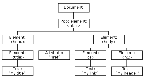
The DOM is a tree-like structure on a HTML page. There is a hierarchical structure of HTML elements as seen in the image above. Depending on how different elements such as <div> are nested within your HTML page, will determine how the DOM/this tree structure will look like.
Back to !important
So let’s say you’re working on a team and somebody styled the body to have a pink text. This will mean that all the text on page will now be pink. You get asked to change the colour of the header font to green. You still want to keep the pink font everywhere else, so you use !important on the header. The example below illustrates this.
<body>
  <p>Here's some text in the body</p>
  <header>
    <h1>Here's a header!</h1>
  </header>
</body>
body {
color: pink;
}
h1 {
color: green !important;
}It’s worth mentioning that !important should only really be used in exceptional circumstances, where the specificity is high, otherwise you will always be overwriting styles.
Part four will cover gradients/backgrounds, accessibility/colours, pseudo elements and classes, and typography.